Color Picker
Overview
ColorPickerManager is the MonoBehaviour that powers the Chroma Palette UI. It synchronizes palette rendering, sliders, input fields, and events across every supported mode (HSV rectangle, hue wheels, texture and palette sampling, etc.). All modes expose HSV/RGB/CMYK/Hex inputs, alpha editing, preview swatches, and live color change events so you can wire the picker into any workflow.
Quick Start
- Drag
ColorPicker.prefab(orColorPickerThemed.prefab) fromAssets/XDPaint/ChromaPalette/Prefabs/into your scene. - Place it inside your UI Canvas where you want the picker to appear.
- Wire the manager to your systems via code:
using UnityEngine;
using XDPaint.ChromaPalette;

public class PaintColorBinding : MonoBehaviour
{
    [SerializeField] private ColorPickerManager paletteManager;
    [SerializeField] private Material targetMaterial;

    void Start()
    {
        // Apply committed colors
        paletteManager.OnColorChanged.AddListener(color => targetMaterial.color = color);

        // Preview while dragging
        paletteManager.OnColorChanging.AddListener(color => targetMaterial.color = color);
    }
}
Modes
ChromaPaletteMode defines the active layout:
- Rectangle: Saturation × Value in a rectangular gradient with a separate Hue slider.
- Circle: Classic hue wheel (Hue on angle, Saturation on radius) with a Value slider.
- CircleFull: Double-cone HSV wheel combining hue, saturation, and value in one control.
- CircleCircle: Hue ring with an inner S/V disc for circular gestures throughout.
- CircleTriangle: Hue ring plus an HSV triangle for high-precision picks.
- Texture: Samples directly from a supplied texture (screenshot, gradient ramp, etc.).
- Palette: Samples from a generated
ColorPaletteasset.
Switch mode at runtime:
paletteManager.SetMode(ChromaPaletteMode.CircleTriangle);

// Texture mode helper
paletteManager.SetPaletteTexture(myTexture);
paletteManager.SetMode(ChromaPaletteMode.Texture);

// Palette mode uses the asset assigned in Palette Settings → Color Palette
paletteManager.SetMode(ChromaPaletteMode.Palette);
See Color Palettes for using ColorPalette assets in Palette mode.
Texture & Palette Settings
Texture and Palette modes share the same TextureBasedModeSettings, so every option behaves consistently:
- Use Bicubic Sampling: Smooth, high-quality interpolation for gradients.
- Snap Cursor: Snap selection to pixel centers (disable for smooth painting).
- Ignore Transparent + Threshold: Skip pixels below the threshold alpha.
- Ignored Colors + Tolerance: Provide swatches that should be skipped when sampling.
- Source: Either
TextureModeSettings.TextureorPaletteModeSettings.ColorPalette.
Configure these through the inspector or your own tooling—most projects keep them serialized on the prefab.
UI Components
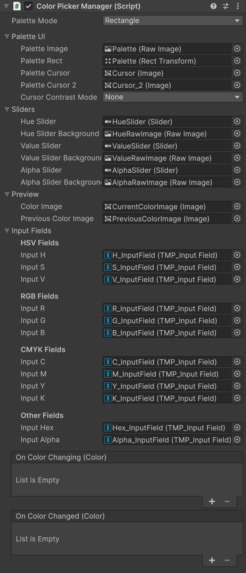
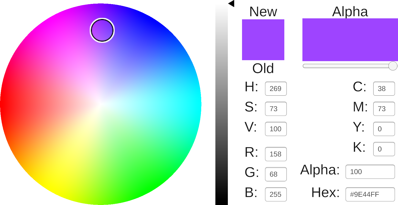
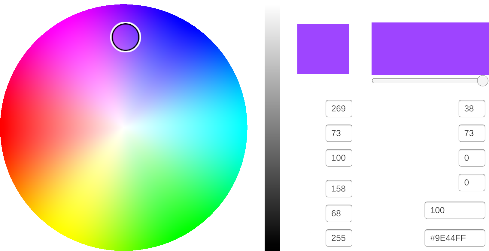
Palette UI
- Palette Image: The main RawImage component displaying the color gradient
- Palette Rect: RectTransform defining the interactive area
- Palette Cursor: Primary cursor for color selection
- Palette Cursor 2: Secondary cursor (used in CircleTriangle and CircleCircle modes for hue ring)
- Cursor Contrast Mode: Visual adjustment options (
None,InvertColor,InvertLightness)
Sliders
- Hue Slider: Controls the color hue with gradient background
- Value Slider: Adjusts brightness/value with gradient background
- Alpha Slider: Sets transparency with gradient background
Preview
- Current Color Image: Displays the actively selected color
- Previous Color Image: Shows the last committed color for quick comparison
Input Fields
HSV Fields
- H Input: Hue value (0-360)
- S Input: Saturation value (0-100)
- V Input: Value/Brightness (0-100)
RGB Fields
- R Input: Red channel (0-255)
- G Input: Green channel (0-255)
- B Input: Blue channel (0-255)
CMYK Fields
- C Input: Cyan value (0-100)
- M Input: Magenta value (0-100)
- Y Input: Yellow value (0-100)
- K Input: Key/Black value (0-100)
Other Fields
- Hex Input: Hexadecimal color code (#RRGGBB or #RRGGBBAA)
- Alpha Input: Alpha/transparency value (0-100)
All inputs are validated and synchronized; changing any field updates the others and the preview.
Events
- OnColorChanging(Color): Fires continuously while the user drags/selects.
- OnColorChanged(Color): Fires when the selection is finalized (e.g., pointer up).
Use OnColorChanging for live previews and OnColorChanged for commits.
Scripting Essentials
// Set color from code (optionally suppress event notifications)
paletteManager.SetColor(Color.red, notify: true);

// Read current color
var current = paletteManager.CurrentColor;

// Toggle modes at runtime
paletteManager.SetMode(ChromaPaletteMode.CircleFull);

// Ensure your ColorPalette asset is assigned in the inspector before entering Palette mode
paletteManager.SetMode(ChromaPaletteMode.Palette);
Performance
- GPU-generated palettes and slider gradients.
- Minimal allocations; UI updates run only when values change.
- Prefer using
OnColorChangedfor commits to reduce update frequency.